

GALAXY RACER
Strong brand equity. Fragmented brand expression.
The original identity had built genuine recognition. The Andromeda icon and arcade typography were known across the esports space, not just familiar, but culturally specific.
The system had started to fracture. Inconsistent across platforms, creators, and events. The visual equity was still there. It just needed recovering.
The system had started to fracture. Inconsistent across platforms, creators, and events. The visual equity was still there. It just needed recovering.
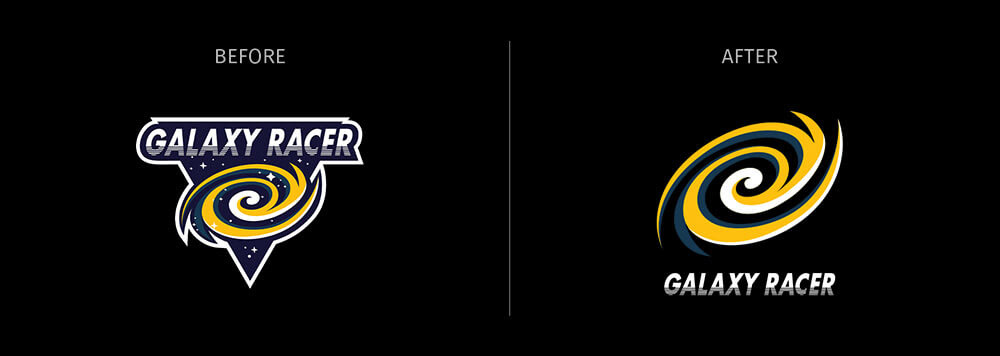
The mark stayed. The typography stayed. Both were simplified into something sharper, cleaner, and built to move across digital surfaces without losing the thread.
Not a redesign. A recovery.
Not a redesign. A recovery.
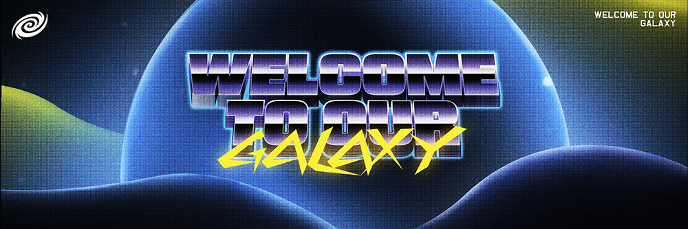
The visual language was drawn from retrofuturism, not as nostalgia, but as a precise set of references. Broadcast graphics. Reflective surfaces. Atmospheric gradients. Type built for speed.
Old enough to feel deliberate. Sharp enough to feel now.
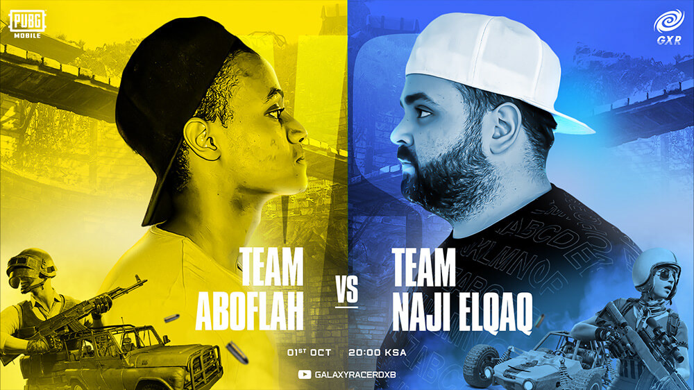
Content creators, tournaments, and live events each carried their own personality. The system had to hold all of them together without flattening any of them.
One brand. Multiple expressions.
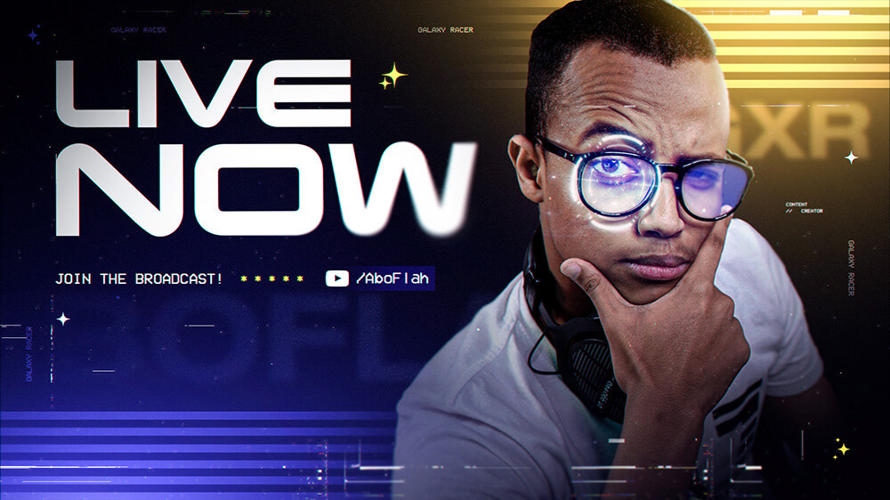
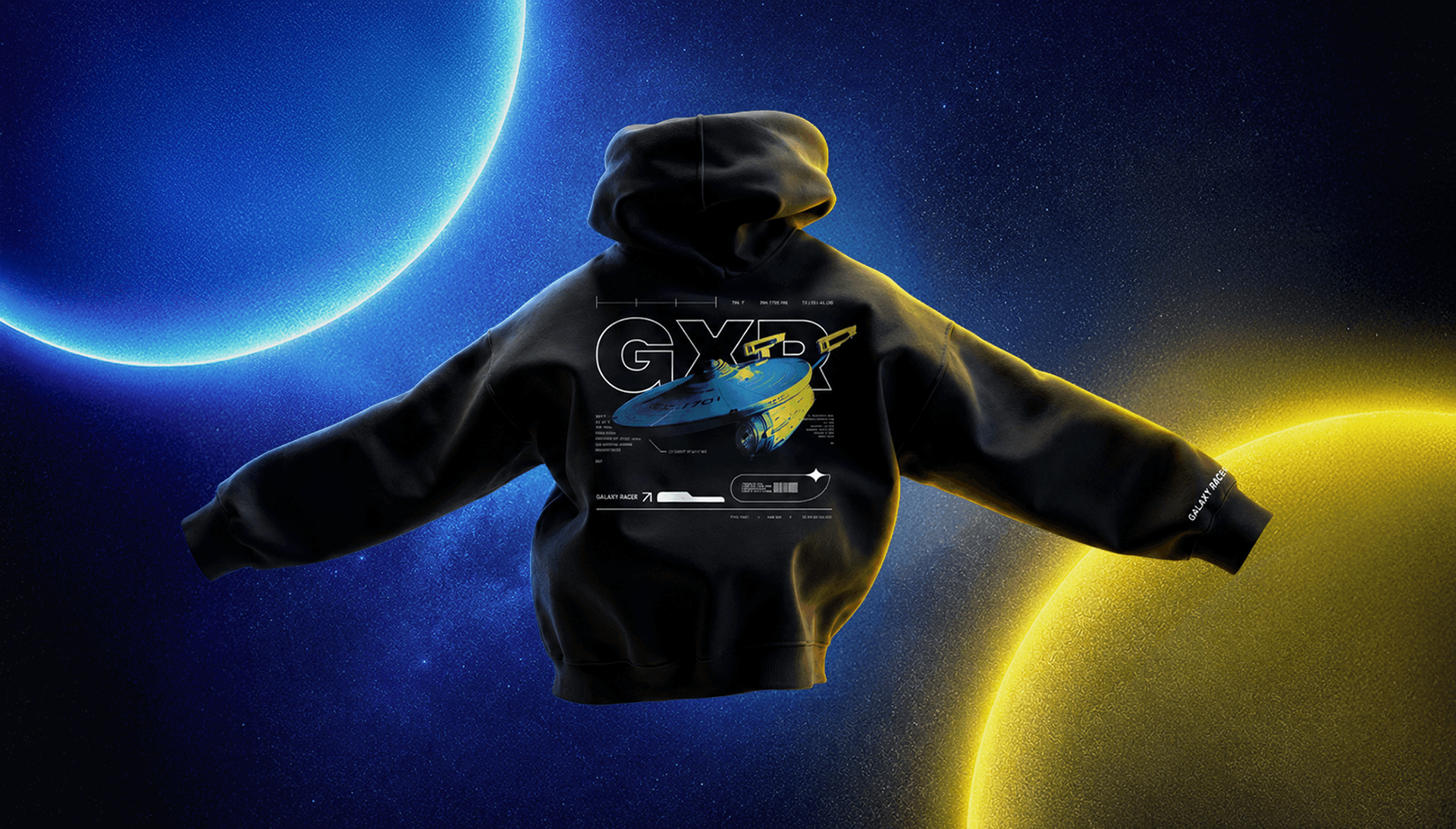
The identity already knew what it was. It just needed to look like it meant it.