

GUILD ESPORTS
The mark deserved a world that matched it.

Co-owned by David Beckham, Guild entered esports from outside the category’s established culture.
Designed by Fergus Purcell, the hand behind Palace Skateboards, the logo arrived carrying the language of street, skate, and earned culture.
It was not a brand to be invented. It was a world to be built.
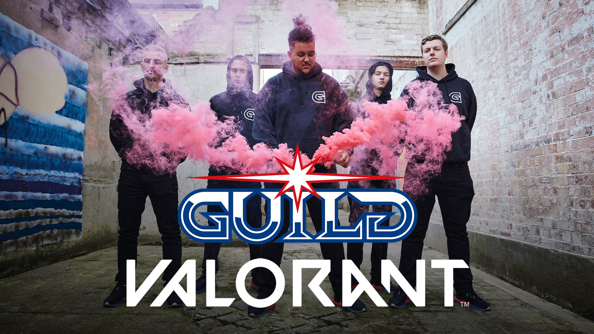
At the time, esports branding had become visually interchangeable. Aggressive type. Synthetic gradients. Disposable graphics built for the feed.
Guild needed distance from that.
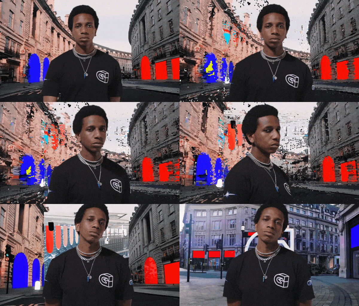
Multiple titles. Different audiences. Different visual cultures. The system had to flex without losing recognition.
The references came from outside gaming. Streetwear. Editorial print. Football culture. Bootleg graphics.
Nothing borrowed from the esports playbook. Because the playbook was the problem.
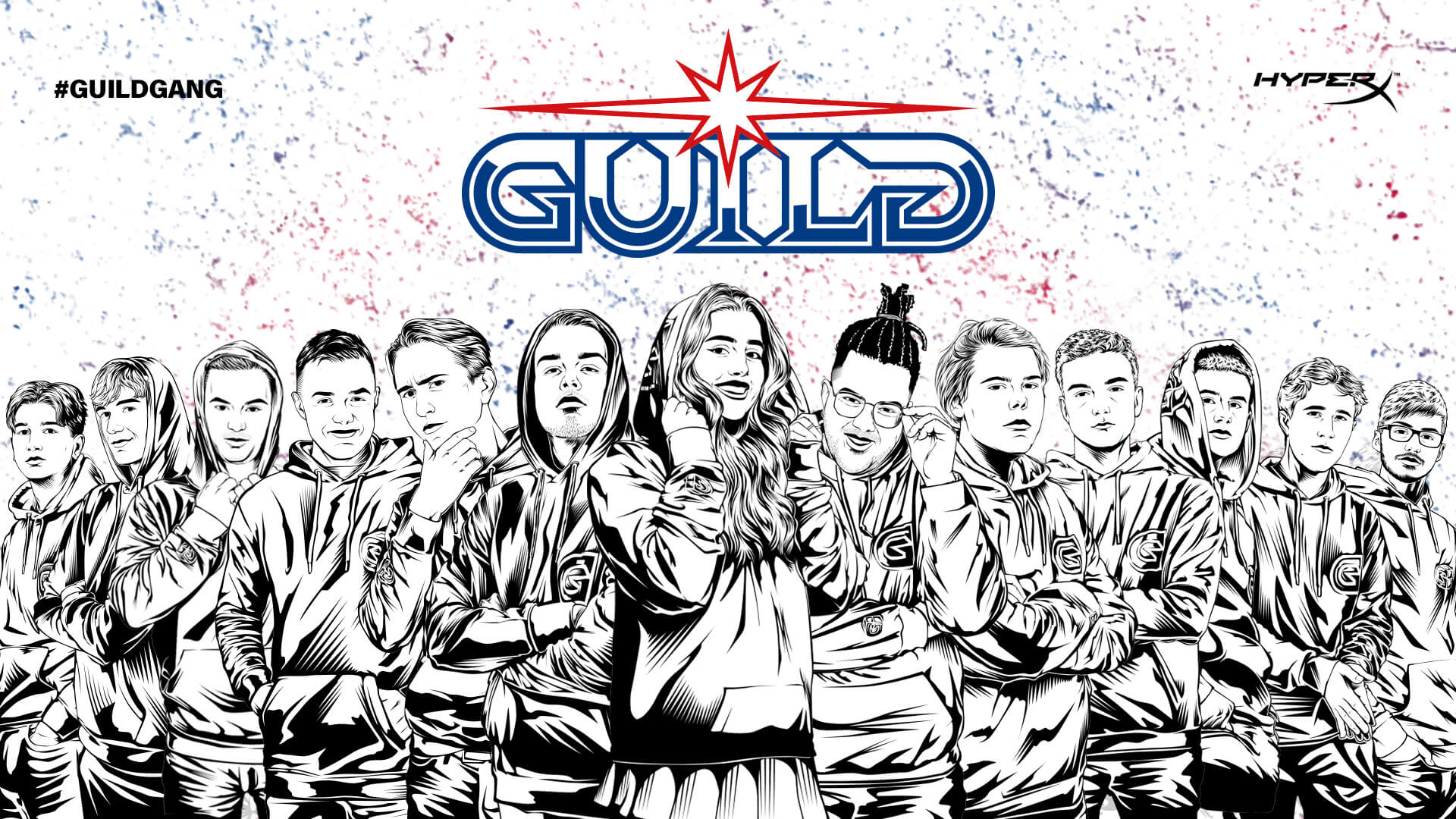

Large type. Limited palette. Immediate recognition.
Texture made the brand feel earned rather than generated.
Texture made the brand feel earned rather than generated.
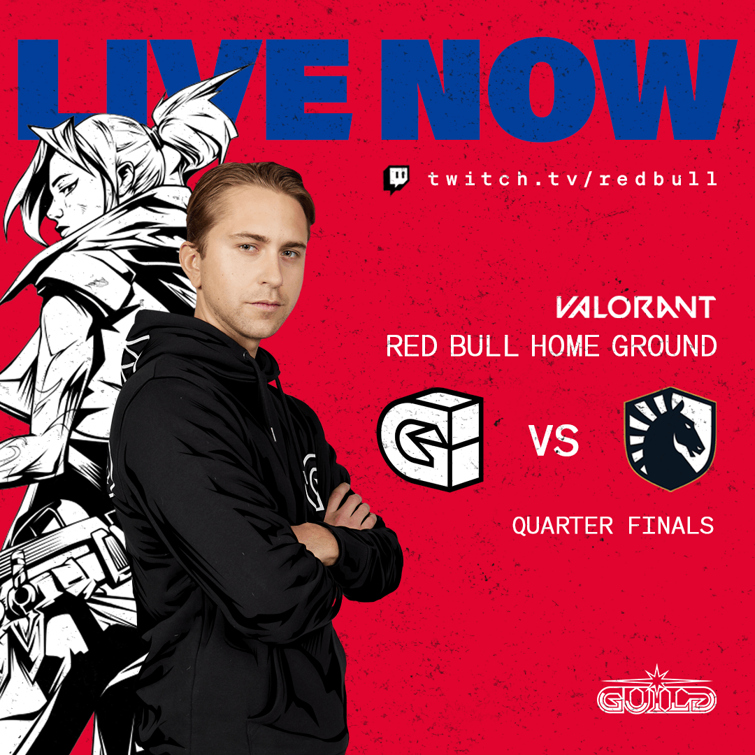
Every illustration was authored, not assembled.
Custom over template → authorship
Texture over render → character
System over asset → world
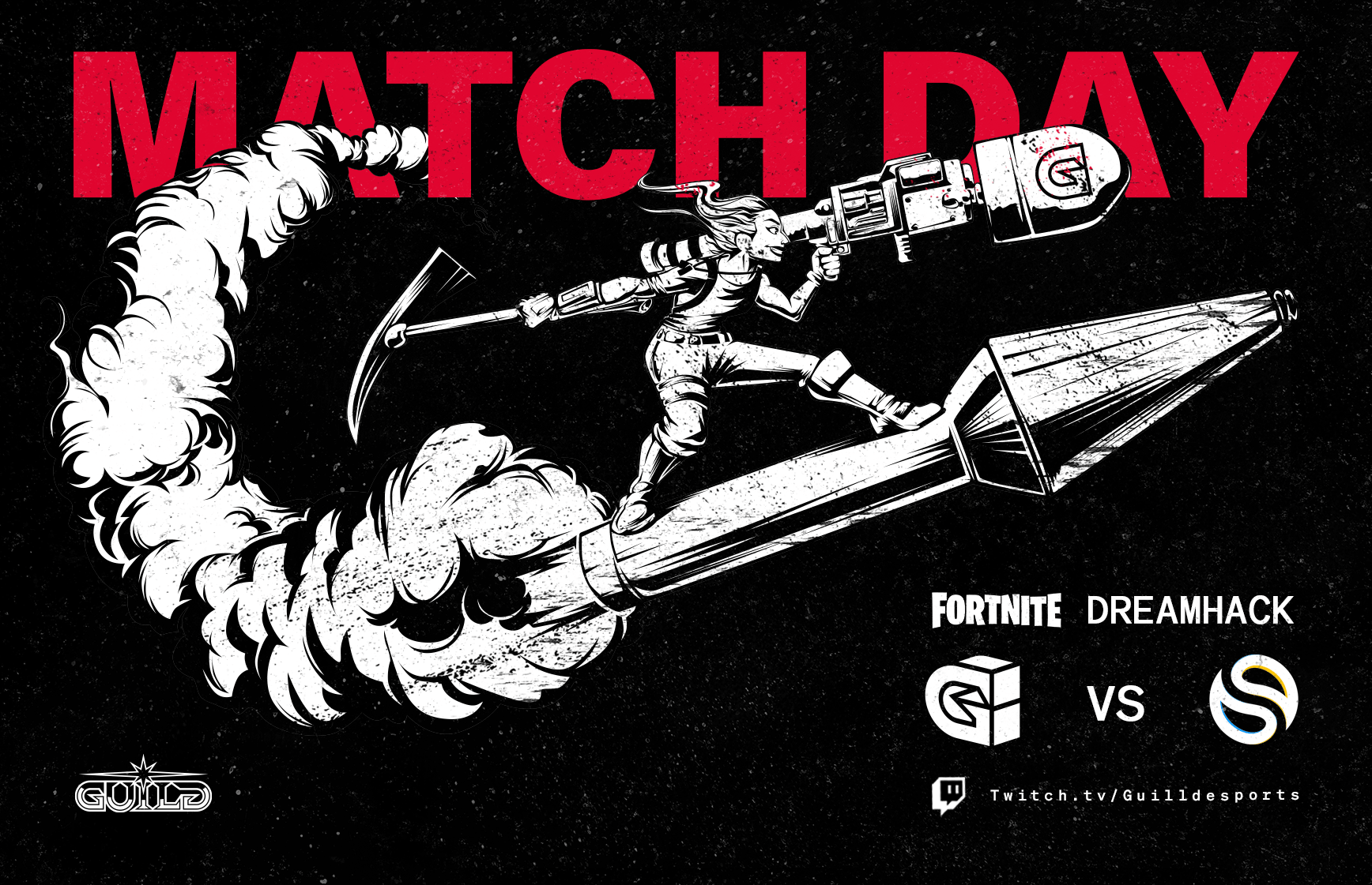
Guild's live programming was treated as cultural publishing. Super Stream Sunday borrowed from music promotion, sports entertainment and youth culture media, not esports convention.
One flag across multiple worlds.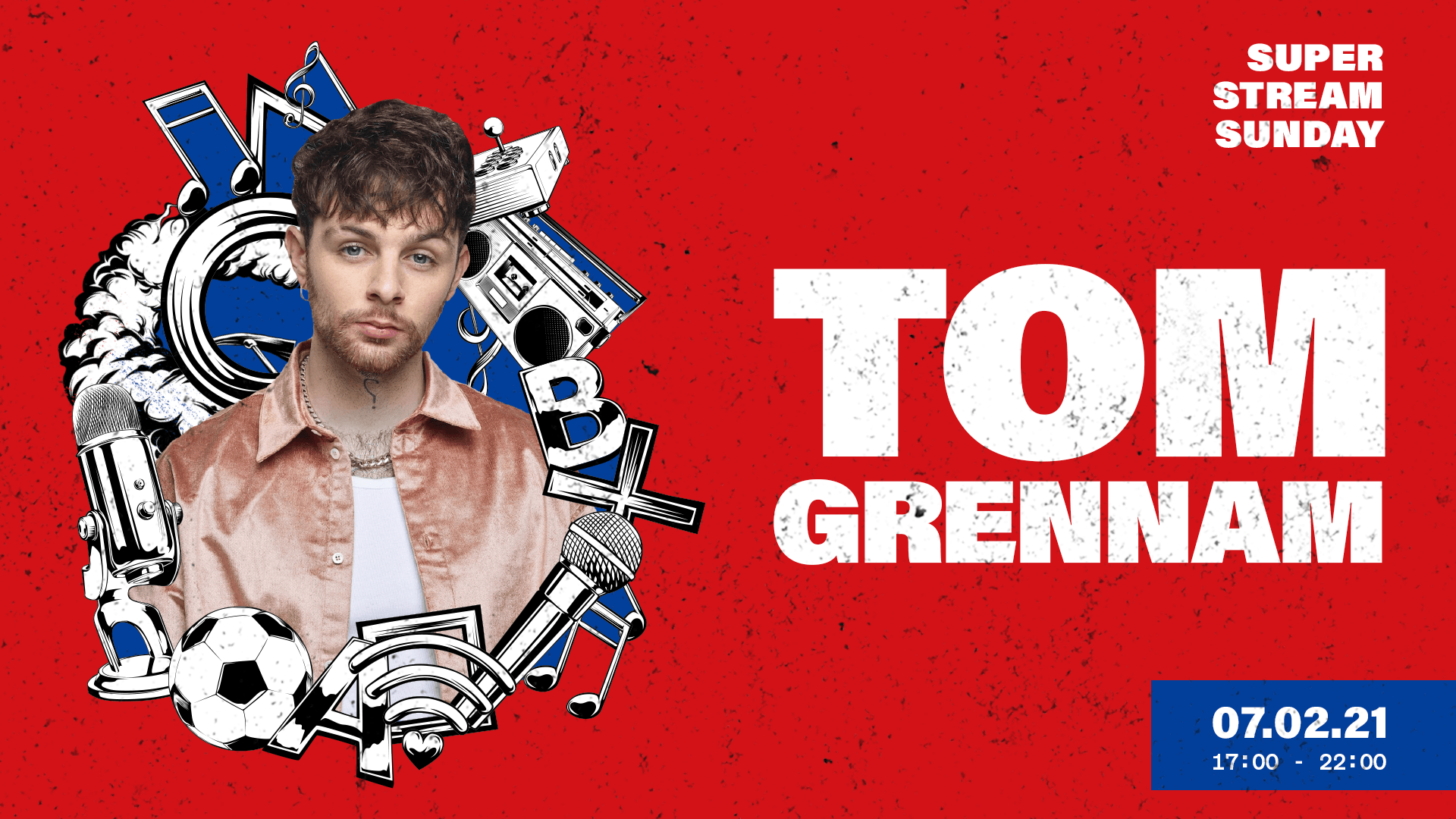
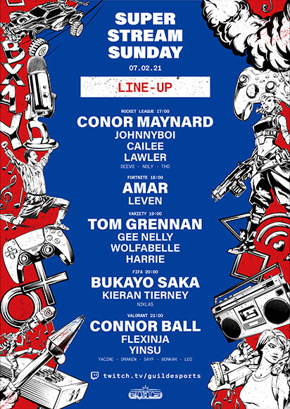
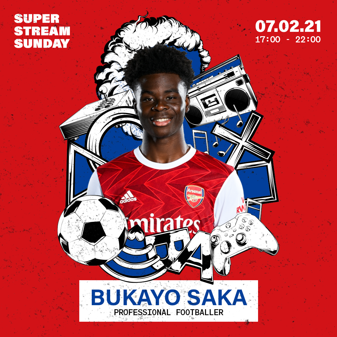
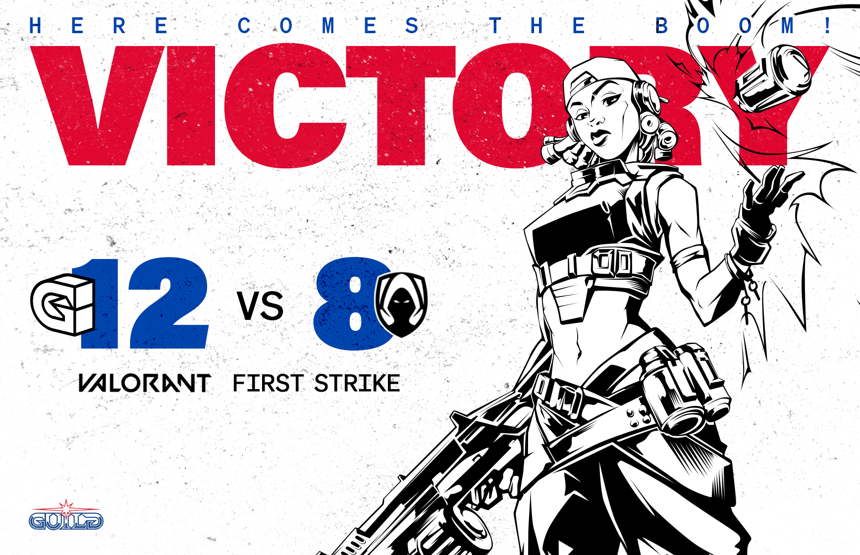
A reduced palette. Enough to build recognition.
The palette never competed with the content. It anchored it.
Reduction over decoration. Recognition over novelty.
The mark deserved a world that matched it.