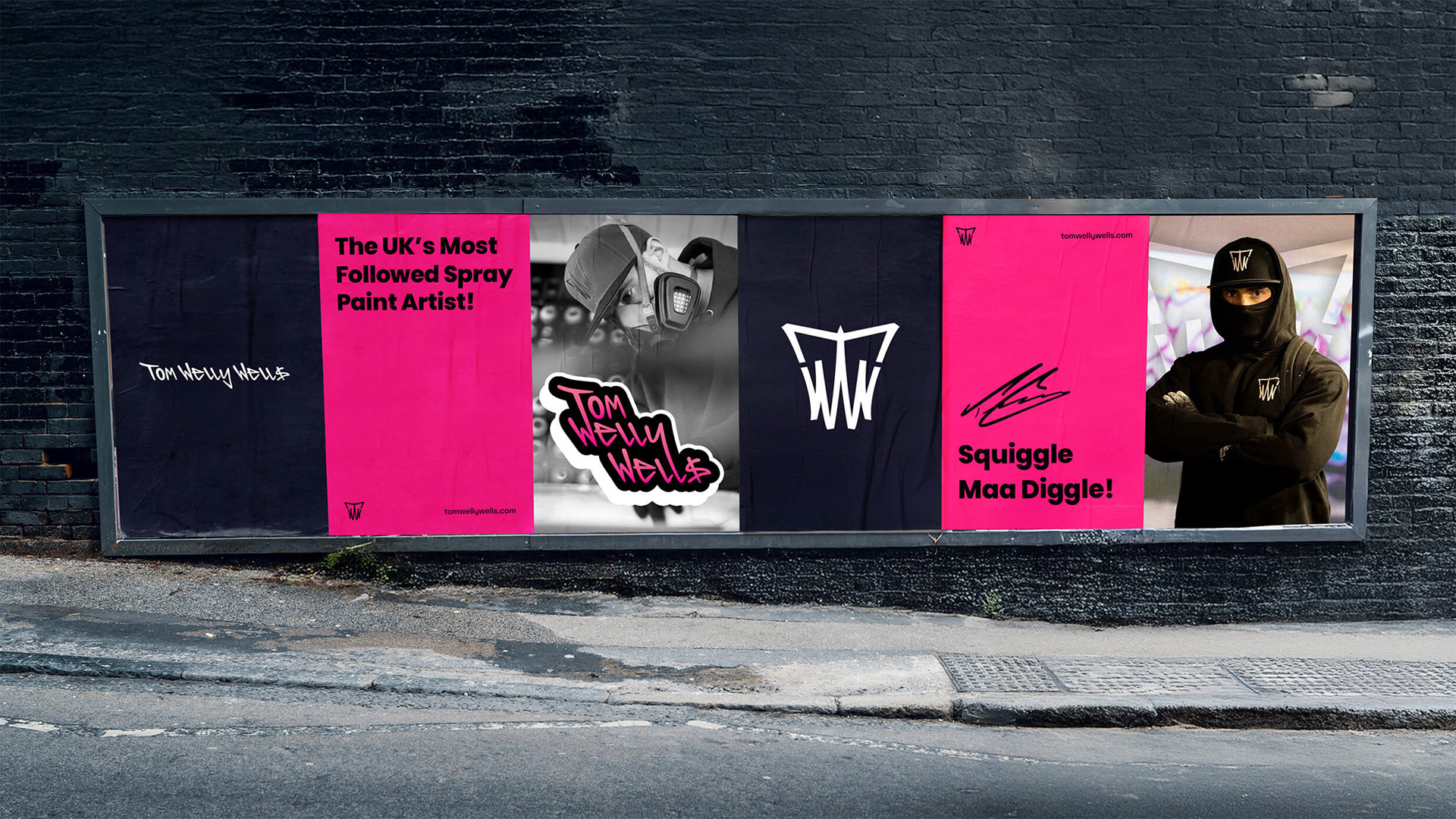

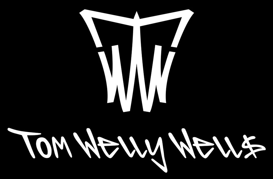
TOM WELLY WELLS
An identity built on authorship

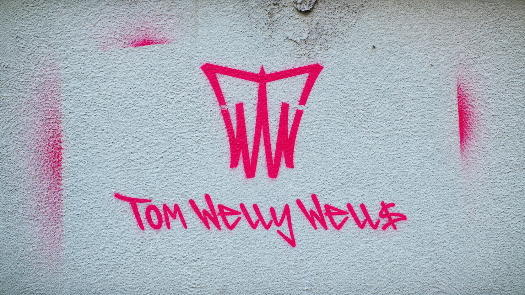
A single mark, designed to be placed.
Every piece Tom creates carries a signature.
Not as decoration, but as proof of authorship.
Not as decoration, but as proof of authorship.
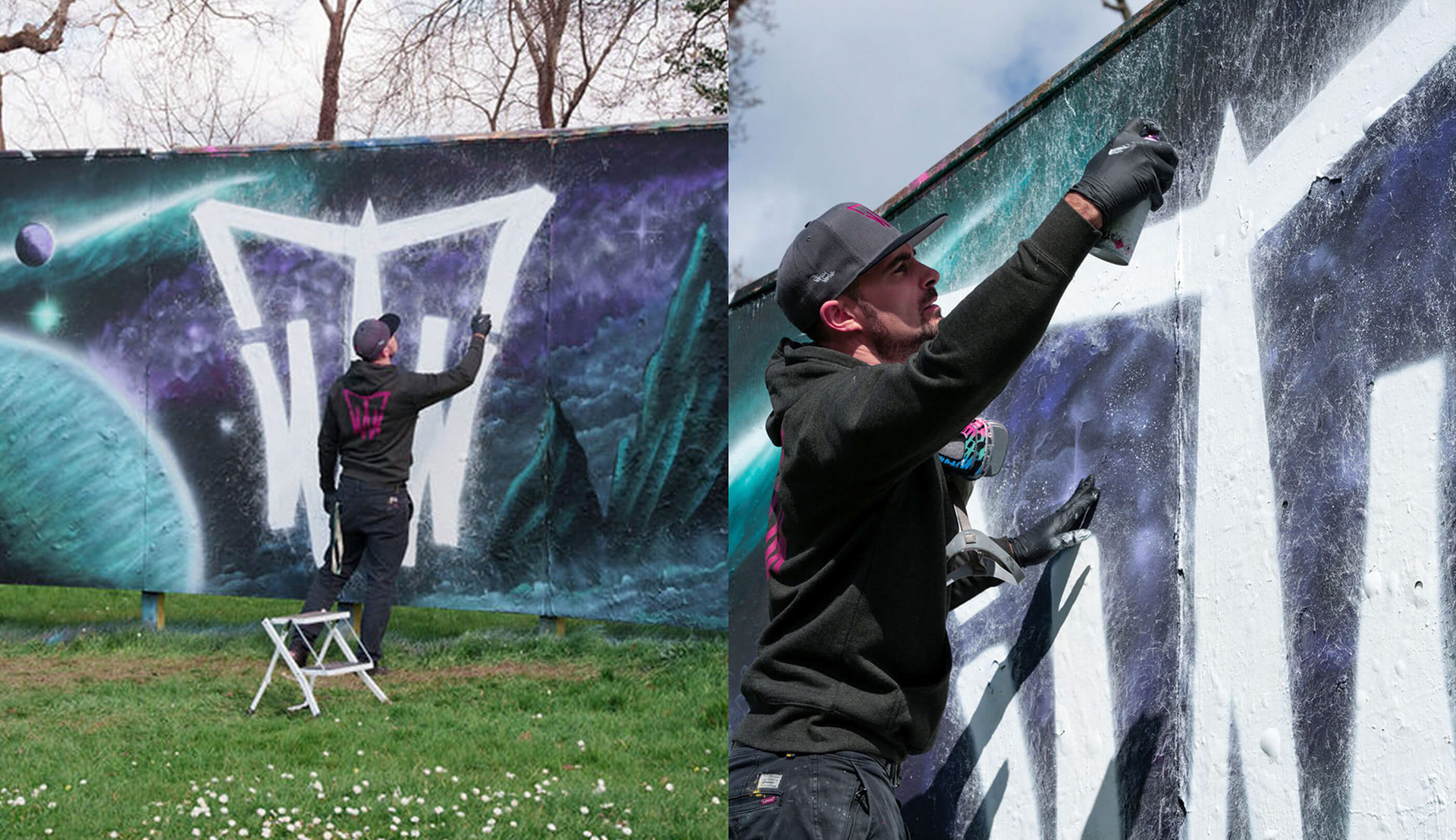
The existing identity described the artist, but never acted like him.
It had to behave, to be applied, repeated, and recognised over time.
Drawn from the language of tagging.
Fast, instinctive, immediate. Not a style to imitate, but a behaviour to translate.
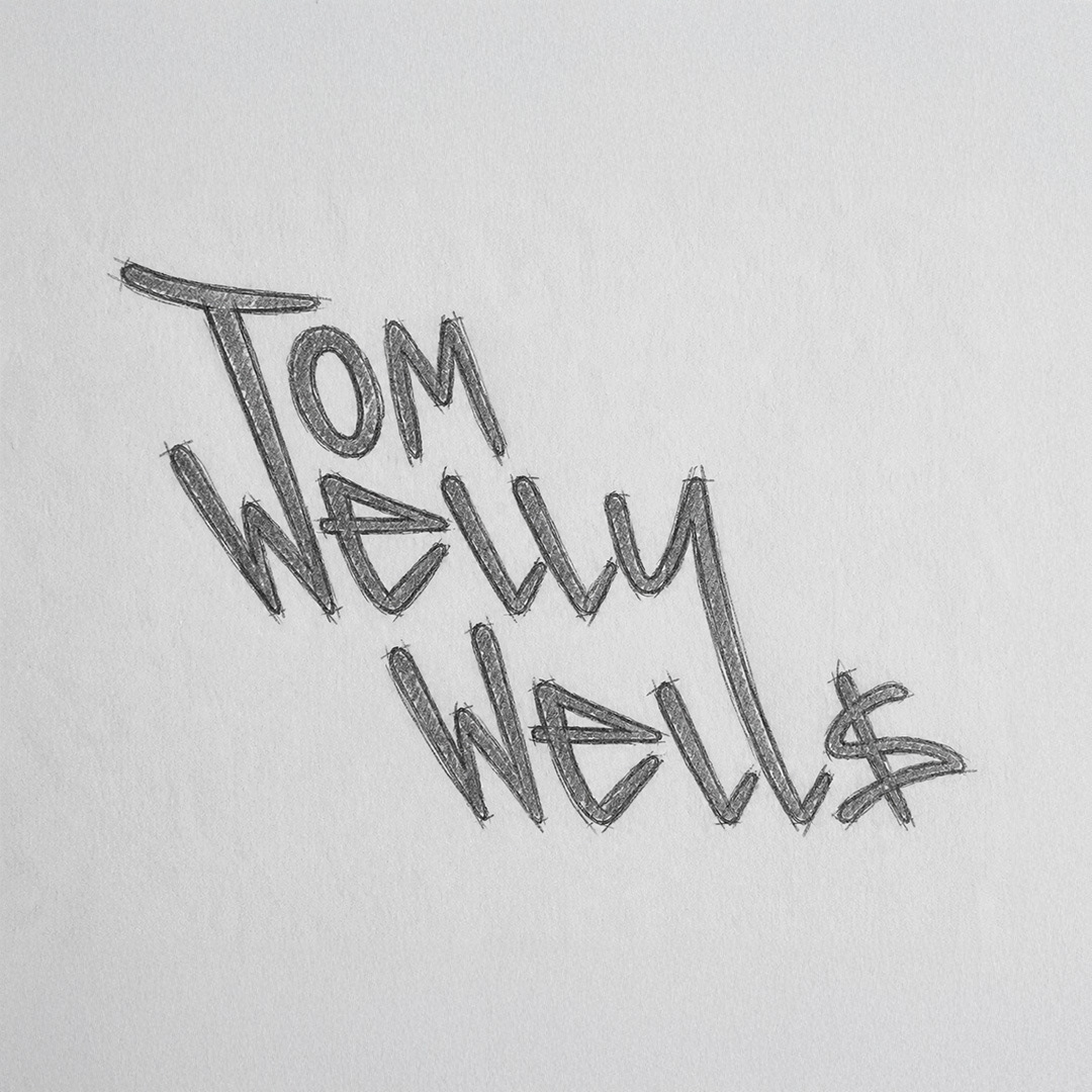
A handwritten wordmark, built from gesture.
Raw enough to feel real, controlled enough to remain legible.
Raw enough to feel real, controlled enough to remain legible.
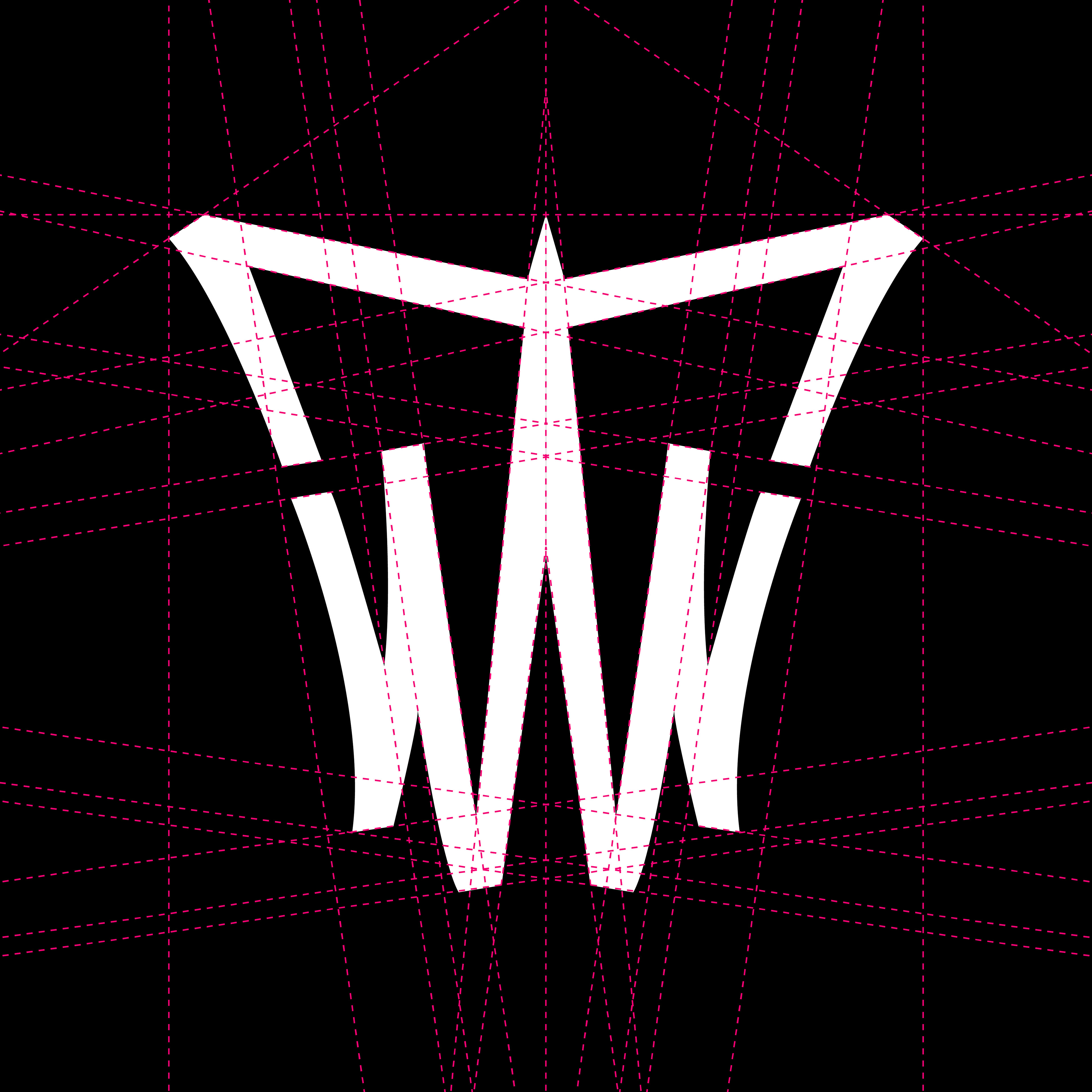
A constructed monogram, a more permanent form of the same idea.
Where the wordmark expresses, the symbol stamps.

Authorship extends beyond the mark.
The signature becomes part of the system.
The signature becomes part of the system.
A gesture already embedded in his content, recognised by his audience as “Squiggle Maa Diggle!”
A unified identity built to move seamlessly between content, product, and physical space.